Project Tempo
Branding an organisation focused on creating practical, sustainable changes that benefit society.
In developing Project Tempo’s brand, the design process centred on communicating the urgency of environmental issues without resorting to overtly alarming or confrontational visuals. Much of the typical eco-activist aesthetic leans on intense colours—reds, blacks, and other bold shades—often signalling urgency or rebellion.
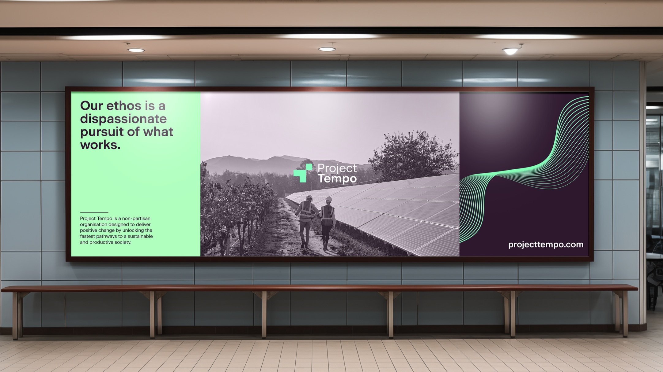
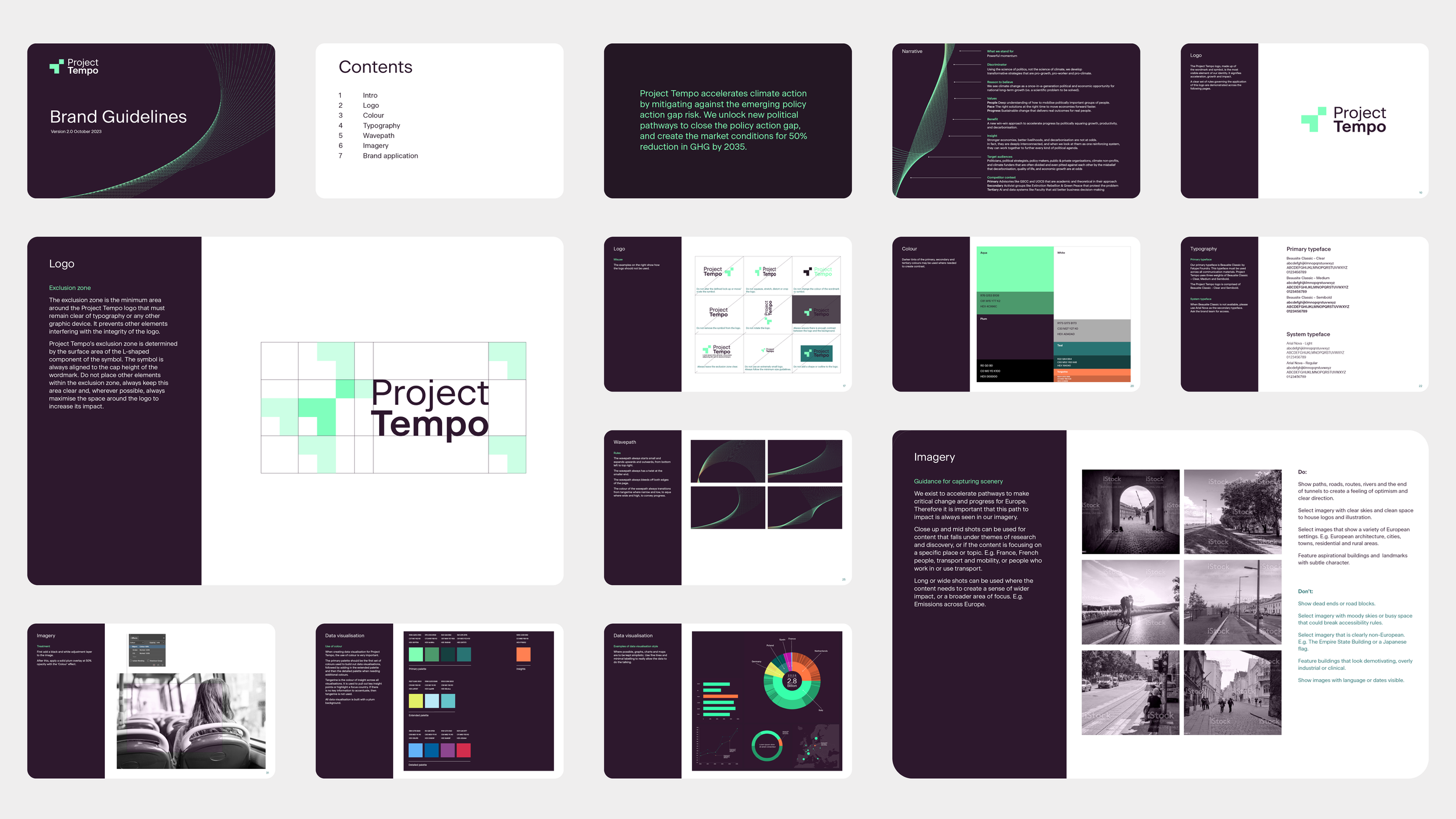
Here, however, a more subtle and composed colour palette was chosen to distinguish Project Tempo as a brand rooted in clarity and balanced analysis. This restrained approach appeals to a diverse audience, creating a sense of calm focus rather than emotional provocation. By doing so, Project Tempo stands out as a voice of rationality and trustworthiness in a field often marked by reactive or intense visuals.
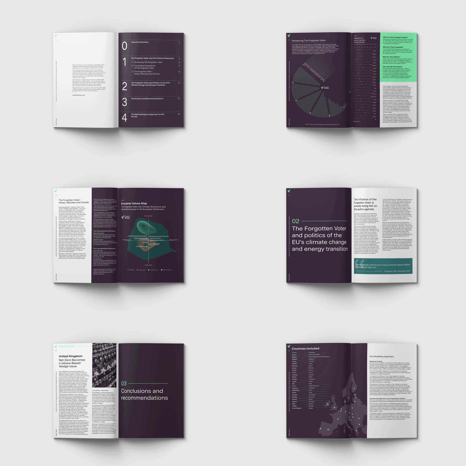
One of the core objectives was to create a brand identity that comfortably bridges the tech and sustainability sectors. This is captured in the green wave motif, inspired by the Fibonacci sequence, which subtly connects data analysis with patterns found in nature. This natural reference grounds the brand, positioning Project Tempo as an entity that views data as part of an interconnected, evolving system rather than just numbers or charts. This fusion of organic elements with a sleek, data-driven design appeals to both tech-minded and environmentally conscious audiences, allowing Project Tempo to disrupt traditional activism aesthetics without compromising on authority or impact.


